A Q&A with “See America” artist Brixton Doyle
Nearly 80 years ago, President Franklin D. Roosevelt’s Works Progress Administration launched the “See America” campaign, which put artists to work designing posters that depict the country’s iconic destinations.
Now, NPCA is teaming up with the Creative Action Network (CAN) to put a modern spin on the series, essentially pairing two of America’s best ideas. One of my favorite artists to contribute work to the cause is Brixton Doyle, a full-time graphic designer and illustrator who teaches at Parsons The New School of Design in Manhattan. I asked Doyle about his early collaborations with CAN, his cross-country travels, and the techniques he employs to evoke the mystery and wonder of the Southwest.
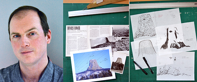
 Doyle’s early brainstorming includes research using a Library of Congress photograph from John C.H. Grabill (circa 1890), ephemera from his father’s scouting days, and a U.S. Geological Survey reference shot with a view of the tower, from the southwest. Photos © Brixton Doyle.
 Doyle creates plates of the line work, including the main features, shadows, secondary details, and trees, all drawn by hand. Photos © Brixton Doyle.
How did you first get involved with the Creative Action Network?
It started with the Gun Show campaign—I had contributed a piece around the time of the Newtown shootings, but I was even more intrigued with their Recovering the Classics campaign around public-domain books. I’d read most of the books on the list, and some of them were my favorites—I’m an avid reader and I think literacy is very important, so that was a project I really enjoyed.
And what drew you to the “See America” project?
[Creative Action Network co-founders] Aaron Perry Zucker and Max Slavkin had come to New York, where I live, for a benefit for Housing Works, which ensures that people with HIV and AIDS have access to affordable housing and medical care. I stopped in, said hello, and discovered that they’re really personable, very smart, and very conscientious. So when Aaron contacted me about producing some pieces for “See America,” I immediately said yes. The Works Progress Administration and the See America poster program, those are icons of 20th-century design, so it didn’t take much prompting.
Do you have a personal connection to any of the places in your posters?
Like many people, I had backpacked across Europe with a couple of buddies in my college days, then years later I realized I’d seen most of Europe but I hadn’t even seen much of my own country. So I reached out to the same guys and we got in a car, drove west across the northern states and back east through the southern states, and saw a lot of the great American landscapes. And over the years, I’ve visited many more.
The two posters I’ve done so far are Devils Tower in Wyoming and the Mittens, a part of Monument Valley in Utah, both of which I’ve been to. Devils Tower, of course, is the iconic mountain featured in “Close Encounters,” and a place that my dad visited years ago when he was a scout, so I have some ephemera from there, from a long time ago. It’s such a striking natural feature—this intrusion of sedimentary rock. Everything else is worn away around it, leaving this really striking monolith that just plays into the simplicity of the old WPA posters. And the Mittens—these are two complementary structures, two giant hands that are miles apart; I can see Native Americans immediately making legends around the forms. So those two sites really resonate with me.
Talk about some of your artistic influences, and how you came about your own personal style.
I’m not sure I want to admit this, but like every other American kid, I was profoundly influenced by comic books—the idea of putting pen to paper and creating something has always fascinated me. For landscape work like this, I’m always thinking of the classic painters like Van Gogh, who has this elemental approach—he used one brush stroke for everything, whether it was a field, fabric, a flower, or the skin on someone’s face, and he was somehow able to take this one stroke and turn it into everything. So I was drawn to the idea of taking a single black pen and creating a sky, or trees, or rock, or someone’s face just like he did. The other big influence for me is Japanese ukiyo-e (you-key-yo-AY), block print-making, which most people probably equate with Hokusai’s The Great Wave or Hiroshige’s 100 Famous Views of Edo or Mt. Fuji. Those are all wood block prints, much like serigraphs, featuring large fields of color and line work on top of it.
Can you talk a little about your process?
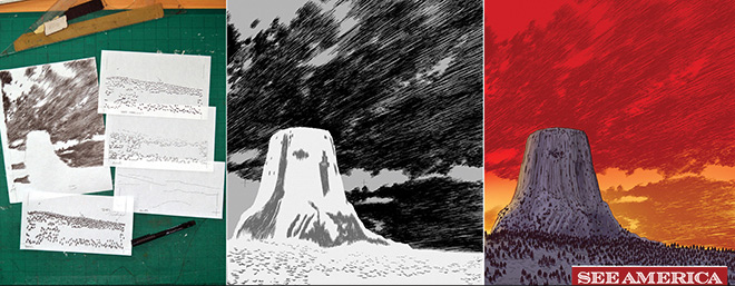
The whole series of original WPA posters were produced as serigraphs or silkscreens, so artists would naturally limit their color palates [so that prints could be produced relatively easily]. So I asked myself what I could do to pay homage to these originals without copying them? All of my pieces are drawn by hand, using some of the mementos from my dad, and reference materials from Park Service photos in the public domain, but both of my images are really impossible perspectives—you’d have to chop down a lot of trees or get up in a plane to get that particular view of Devils Tower. And to get that view of the Mittens, you’d probably have to break a lot of Navajo laws, but beyond that, I’ve been pretty faithful to the details of each site. I create each color as a separate plate, a separate line drawing, then scan them all into the computer, and build up the image using seven separate plates, each with one color. So the process is very similar to the old-school approach—I’ve just added a lot more detail to give it a more modern feel.
Read more about the See America project in our recent blog story and the Winter 2014 issue of National Parks magazine. Check out all of the poster designs at seeamericaproject.com.
About the author
-
General
-
- NPCA Region:
- Northern Rockies